Broughton Building Solutions
Visual Identity / Brand Guidelines / Logo Design / Business Stationary / Web Design / Uniform Design / SEO Optimisation

Branding, business stationary and uniform design for for a start up business named Broughton Building Solutions who specialises in pipe work engineering.

Brief
For this project I was tasked with creating a new brand strategy and identity for Broughton Building Solutions, a construction company that specialises in pipe work. The client had two main objectives: to increase the number of people requesting quotes and to improve their visual identity, which was incoherent and mismatched.
They wanted a brand strategy and identity that conveyed a sense trustworthiness and professionalism, while highlighting their unique selling proposition of seamless project execution through meticulous planning. As founder Lewis Broughton says, "One minute we're there and one minute we're gone, like we're invisible workers”. They also wanted a bold and established look that would appeal to their target audience, which consisted of both domestic and commercial clients. The challenge was to create a design that balanced these seemingly disparate qualities; bold and invisible.

Inspiration & Process
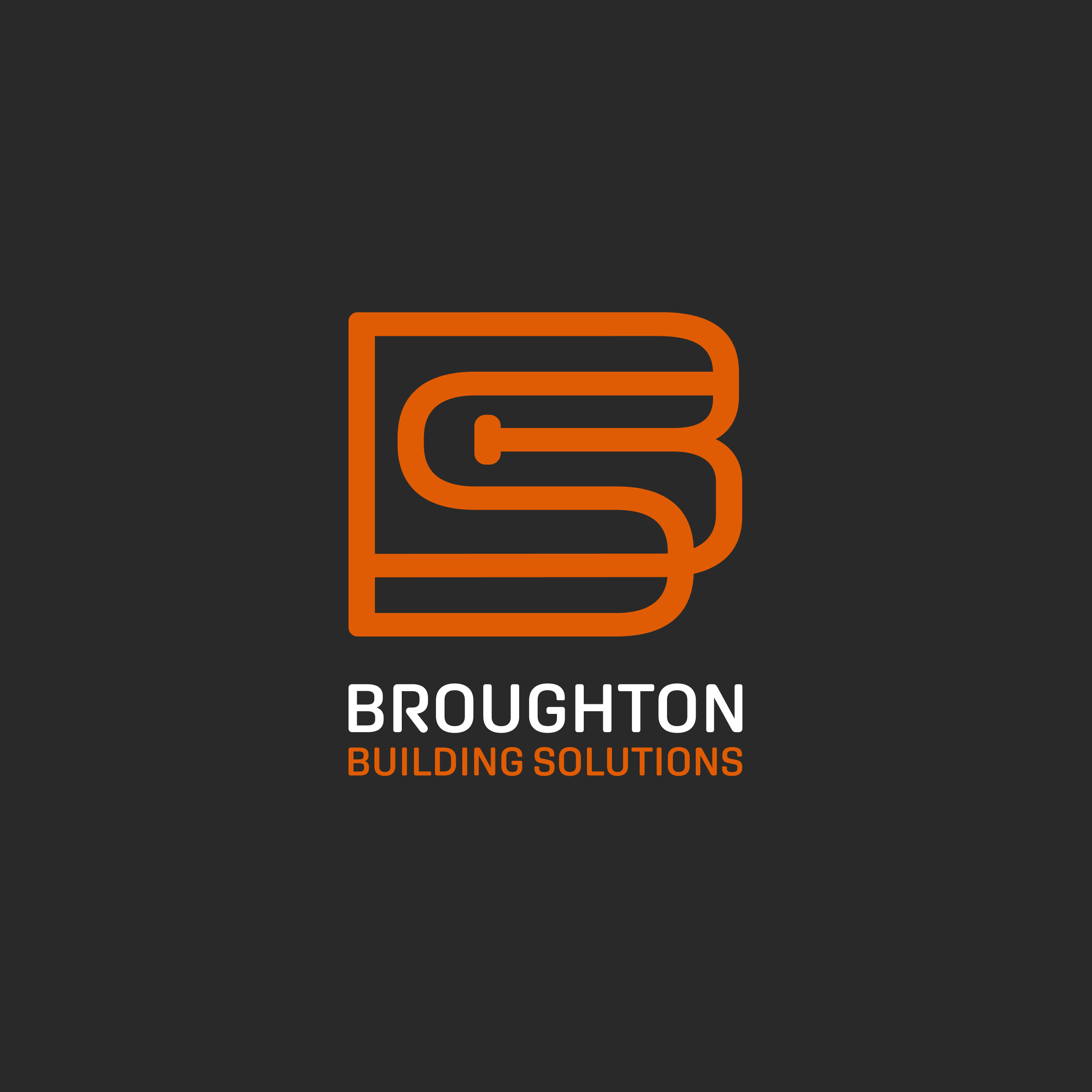
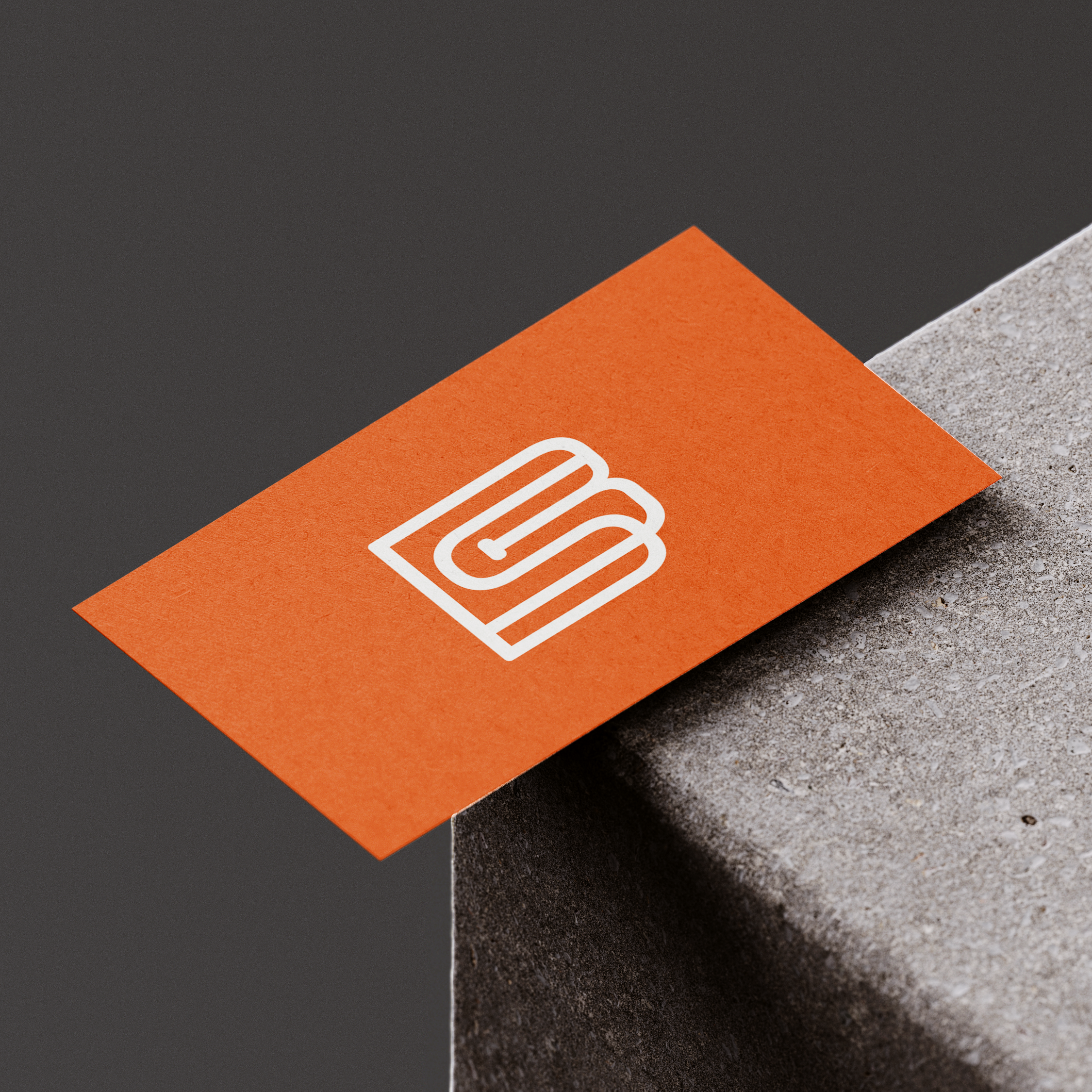
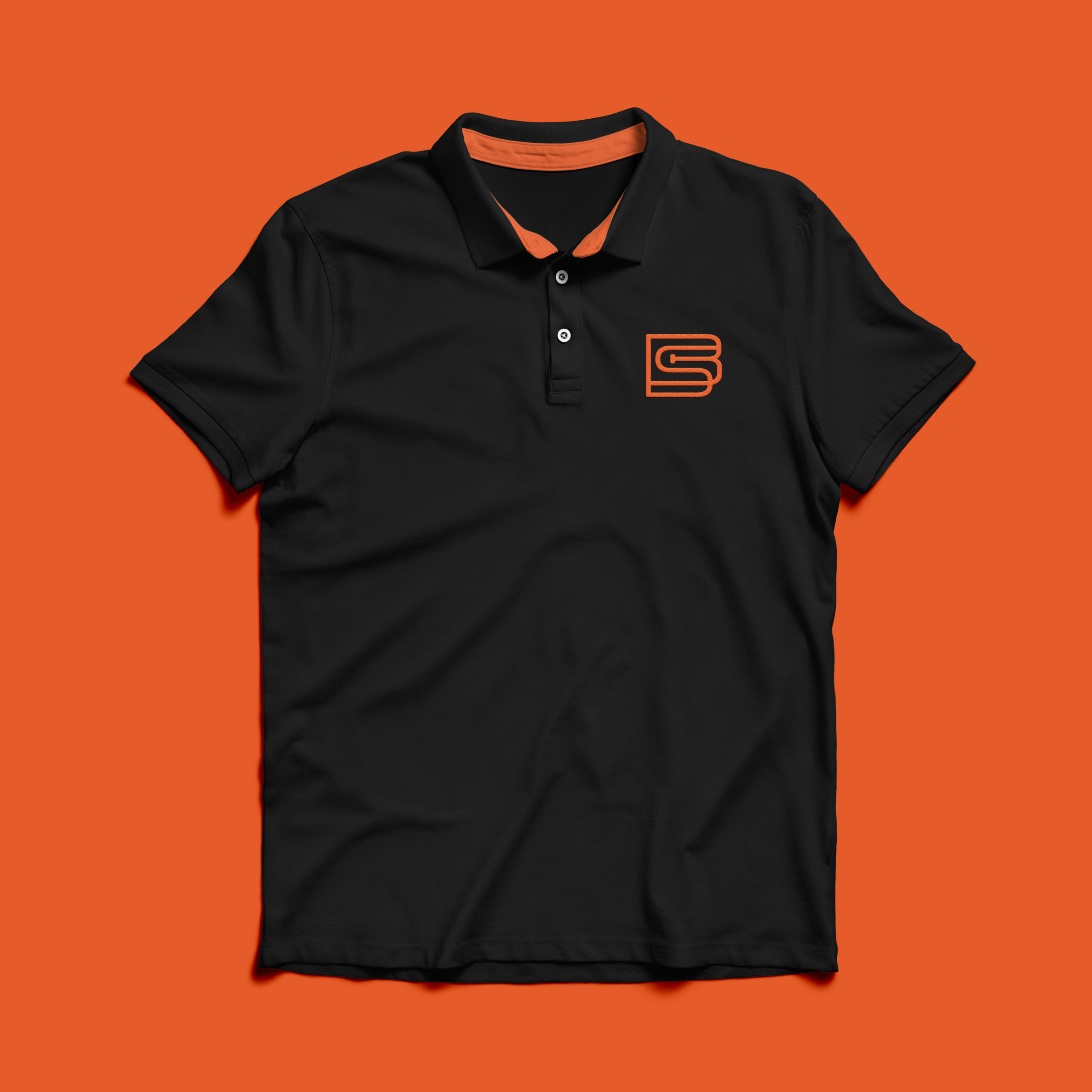
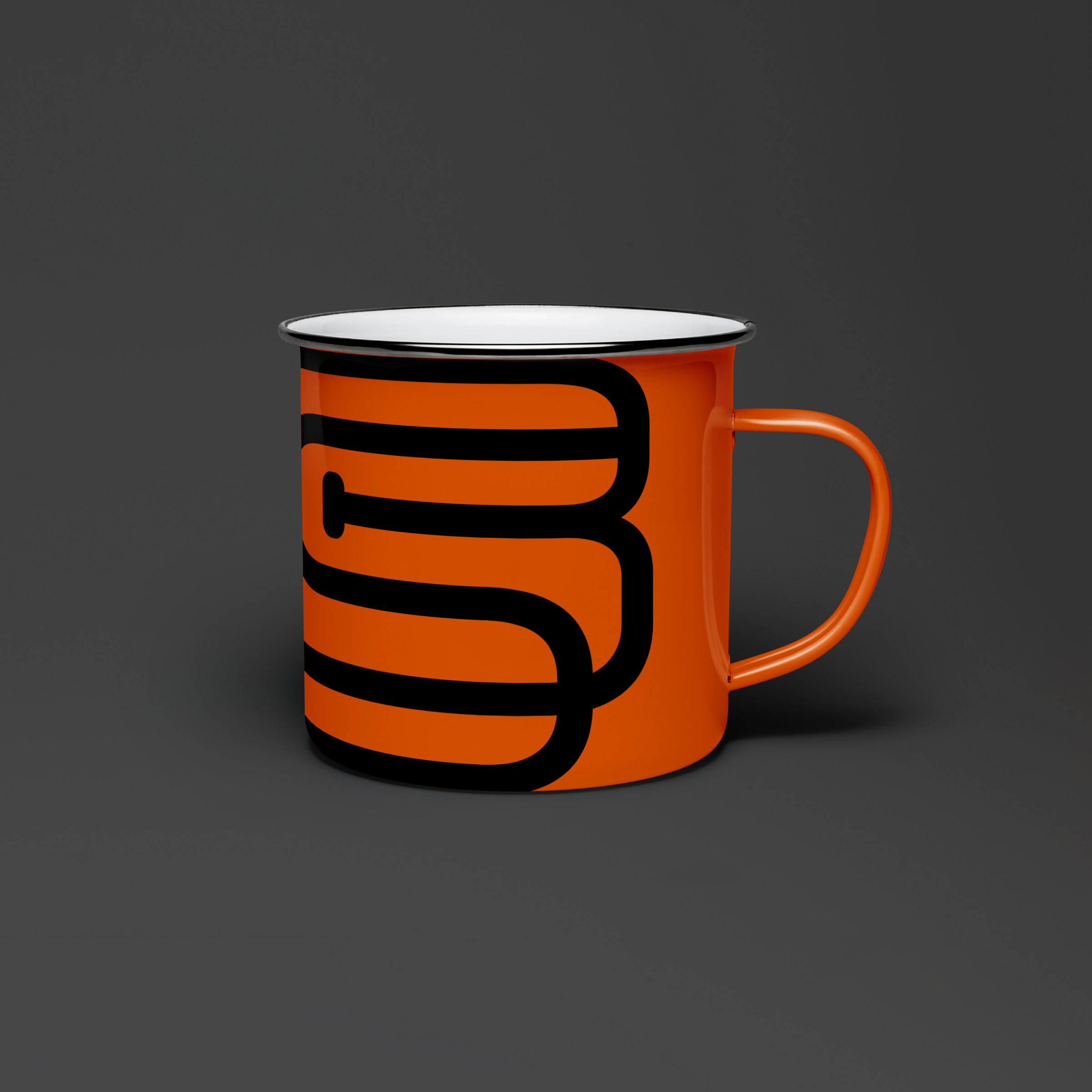
To achieve these goals, I drew inspiration from the flowing form of pipe works and the orange of safety clothing, such as hard hats and high visibility jackets. The seamless and smooth work flows of Broughton Building Solutions are reflected in the continuous line of the logo and icons, while the boldness is conveyed through the colour palette. Large curves at low transparency add depth to the backgrounds, hinting at the 'invisible' aspects of the brand's USP. We developed a brand guideline to ensure consistency across all future materials, and created uniforms and business stationary to further strengthen the new visual identity.
In addition, I designed a website that showcased Broughton Building Solutions' unique mission, values, and services. The user-friendly design and informative content, helped potential clients make confident and well-informed decisions to use the company, leading to an increase in quote queries.

Outcome
In summary, the new brand identity and website design successfully positioned Broughton Building Solutions as a professional and reliable construction solutions company that resonated with their target audience. This resulted in an increase in quote inquiries, which was one of the client's primary goals. Effectively communicating the company's unique mission, values, and services, means Broughton Building Solutions is now perceived as a trusted and respected player in the industry.
While I would have liked to explore more creative options with the uniforms, I had to keep budget and practicality in mind. In the end, we decided that plain black was the most cost-effective and functional choice, considering the potential hazard of getting them dirty. Although this was frustrating, I understand the importance of working within constraints, and I am committed to finding innovative solutions that align with my clients' budgets and needs. Nevertheless, the client was very pleased with the final result.
Related work