WILDERNESS
FESTIVAL
A visual identity inspired by co-ordinates and maps for an arts festival set with in a forest.


Inspiration
Wilderness Festival takes place at Cornbury Park, Oxfordshire. Festival goers can expect arts, crafts, well being workshops, performance art and banquets all set amongst beautifully, wild forest lands.
Thinking about escaping from hum drum but busy work lives, I felt the an angle that focused on being guided through the wilderness to an artistic nirvana would be the basis of my approach.
The guiding element brought to life with references to orienteering apparatus used to navigate in wild expeditions such maps, compasses and coordinates.
The lively, energetic colours that made up my colour scheme were inspired by festival lights, costumes and flags, seen in my own photos from festivals I had attended and video footage used to advertise the festival from previous years.
Remaining true to the arty and crafty nature of the festival I decided to use screen print and hand crafted paper to add texture and a sense of artisan to my visual outcomes.

Process
I created custom typefaces for this project, with rough, wonky edges I wanted the type to have an organic, wild feel. I drew the lettering with my left (non-dominant) hand and blocked them in roughly with chalk. Chalk I chose for its natural quality and the texture it provided. Scanning this to digitise the type, I had my alphabet ready to use across my collateral.
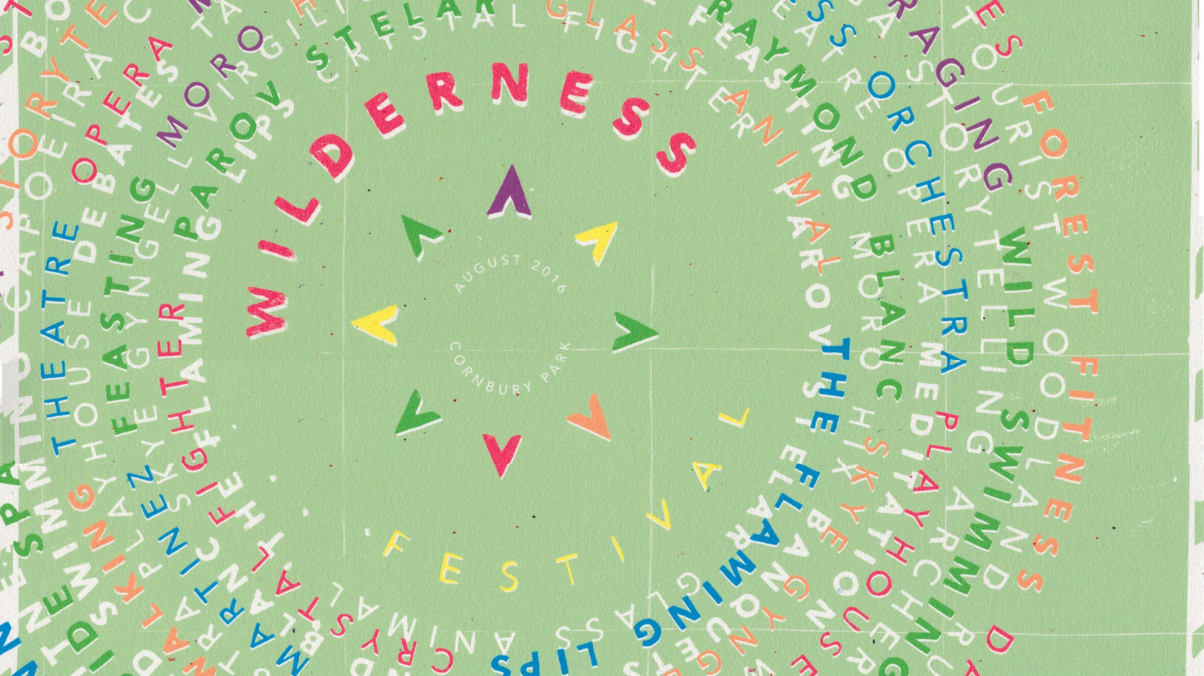
The logo identity for the festival was based on a cross over between a compass face and and campsite. Placing tents in a circular form with one slightly larger pointing north created a the arrows of a compass face. The lettering I placed off centre, which allowed the ‘n’, ‘s’ and ‘w’ to sit in according to their positions on a compass. I liked the sense of movement this gave the logo.

The poster took the form of a map, the hand drawn dotted lines showing the perimeter of the festival grounds is an accurate outline of the shape of Cornbury Park. I chose to place the acts and workshops in a circular form around the logo, which is against the traditional column approach to festival line ups, but creates motion mimicking the motion of a compass. Drawing the eyes inward toward the logo mark, location and date which is important.
This project was produced during my time at university, in order to make the most of the opportunity I applied these visuals across appropriate collateral which I hadn’t designed before. Thinking about customer journey from seeing the posters, to purchasing tickets through to time at the festival I designed landing pages for a website, an app, merchandise and environmental decor including way finding elements.